AquaFX Documentation
AquaFX is an open source project for JavaFX, which creates a native JavaFX skin for Mac OS X. It styles the controls of JavaFX to an appearance of the Mac OS X look and feel named Aqua. To achieve this, the built in ability of JavaFX for skinning and applying CSS defninitions is used.
General purpose
AquaFX gives developers an easy-to-use possibilty to change the whole look of their application, by including the AquaFX project and applying some additional lines of code. This helps to offer a JavaFX application, which does neither feel nor look foreign to a Mac OS user. The recommended OS for applications, styled with AqauFX, is Mac OS X Mountain Lion. All controlsare styled with this OS-Version as guideline. Yet, it can be used on any OS which supports JavaFX, because AquaFX is OS independent, with exclusion of some special modifications.
Quickstart
You can easily style your complete JavaFX application by just calling AquaFx.style(); with import of import com.aquafx_project.AquaFx; This will set the CSS Styles for all controls that are supported by AquaFX. Once this is done your application should look like a native one.
Using AquaFX
Requirements & Restrictions
OS
AquaFX is highly recommended for Mac OS X.
Although JavaFX is OS independent, there are special appearences, which cannot be achieved on other systems, like getting a JavaFX MenuBar in the MenuBar of Mac OS X an a Windows System:
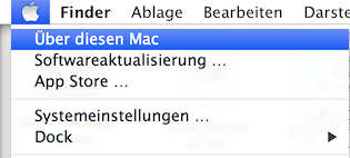
All cases, which do have such restriction will be highlighted with a warning.
Supported platforms
AquaFX works with JDK™ 8 Early Access Releases. Minimum version is Build b92, latest tested and working verison is Build b94, which is recommended to use.
Due to copyright restrictions and technical constraints, AquaFX can be run on non-Mac OS X systems for development purposes only.
License terms
AquaFX is free for commercial and non-commercial use.
Use of the Aqua user interface is only licensed for Apple hardware running an Apple operating system. The Aqua user interface generated by the AquaFX Skin is copyright by Apple Inc. Aqua is a trademark of Apple Inc.
With exception of the Aqua artwork in the code (images and other graphical elements which reproduce Aqua), Aqua is licensed under the 3-Clause BSD license. We are not lawyers, but our interpretation of this license suggests to us that it is business friendly, requiring only the redistribution of the 3-clause BSD license we distribute with AquaFX. As always, I suggest you review the license with the appropriate people, rather than take the advice of software engineers. If this license is not suitable, please contact Claudine Zillmann to discuss an alternative license.
Including AquaFX in your project
Download JAR
You can download the JARS here.
Maven
AquaFX is deployed to Maven Central and can be found here. To use AquaFX in your Maven based application you only have to add the dependency:
<dependency>
    <groupId>com.aquafx_project</groupId>
    <artifactId>aquafx</artifactId>
    <version>0.1</version>
</dependency>
Style your application
You can easily style your complete application by just calling AquaFx.style();. This will set the CSS Styles for all controls that are supported by AquaFX. Once this is done your application should look like a native one.
Further modifications, like changing the size or using special variants of controls, which are provided for a more native look are described in section “Control Variations”.
Architecture
This section describes the achitecture of AquaFX and the possibilties of usage.
Overview
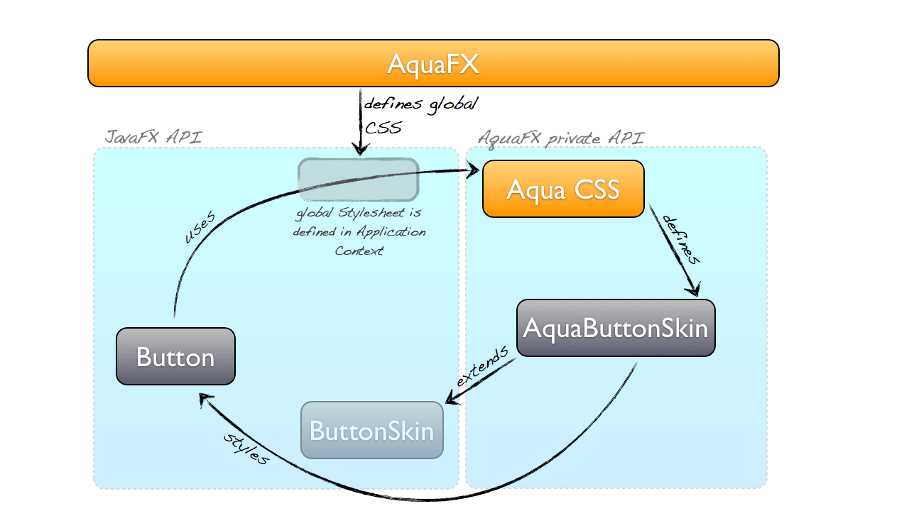
AquaFX is using the JavaFX provided ability of skinning. This means, that the developer does not have to work with special control classes, like e.g. AquaButton extending a usual JavaFX Button, but is free to use all standard controls which will look like controls from Mac OS, though.
This is because appearance is determined by the CSS and skin-classes, the control uses.
CSS
The core of all visual appearance of AquaFX controls is in the CSS.
The CSS is based on the definitions provided by Caspian, the first default CSS style of JavaFX. AquaFX has a complete css styling for all controls. Furthermore all additional stuff, like sizing,different control-types and SVG icons, is defined here.
ControlSkins
Skins, which needed special implementation extend the default skins of the controls. This ensures that no standard functionality gets lost. A typical use case for extending skins is to apply effect-chaining e.g. for a realistic Mac OS focus appearance or to add animation or CSS properties.
The naming convention for extended skins is AquaSkin for *Skin (AquaButtonSkin for a ButtonSkin). The AquaSkins are included by CSS, using the -fx-skin property.
The AquaFX class and the ControlStylers
The AquaFX class is the main intersection between your own application and AquaFX.
This class comes with several static methods which allow you to modify your controls in addition to the standard look, which comes with applying AquaFX to your UI.
| method | description |
|---|---|
style() |
Enables the CSS of AquaFX as default stylesheet, so that the application is styled like Mac OS X Aqua. |
styleStage(Stage stage, StageStyle stageStyle) |
Changes the style of the Stage to the applied StageStyle. This allows e.g. unified ToolBars with no border or small utility dialogs. |
setGroupBox(Pane pane) |
Styles a Pane or descendant of Pane to a GroupBox. This is an area with rounded borders and a darker background color inside the Pane. |
resizeControl(T control, ControlSizeVariant sizeVariant) |
The given Control is resized to the given ControlSizeVariant. |
createButtonStyler() |
Creates a ButtonStyler with fluent API to change the default style of a Button. |
createCheckBoxStyler() |
Creates a CheckBoxStyler with fluent API to change the default style of a CheckBox. |
createChoiceBoxStyler() |
Creates a ChoiceBoxStyler with fluent API to change the default style of a ChoiceBox. |
createColorPickerStyler() |
Creates a ColorPickerStyler with fluent API to change the default style of a ColorPicker. |
createComboBoxStyler() |
Creates a ComboBoxStyler with fluent API to change the default style of a ComboBox. |
createLabelStyler() |
Creates a LabelStyler with fluent API to change the default style of a Label. |
createPasswordFieldStyler() |
Creates a PasswordFieldStyler with fluent API to change the default style of a PasswordField. |
createProgressBarStyler() |
Creates a ProgressBarStyler with fluent API to change the default style of a ProgressBar. |
createProgressIndicatorStyler() |
Creates a ProgressIndicatorStyler with fluent API to change the default style of a ProgressIndicator. |
createRadioButtonStyler() |
Creates a RadioButtonStyler with fluent API to change the default style of a RadioButton. |
createScrollBarStyler() |
Creates a ScrollBarStyler with fluent API to change the default style of a ScrollBar. |
createSliderStyler() |
Creates a SliderStyler with fluent API to change the default style of a Slider. |
createTabPaneStyler() |
Creates a TabPaneStyler with fluent API to change the default style of a TabPane. |
createTextAreaStyler() |
Creates a TextAreaStyler with fluent API to change the default style of a TextArea. |
createTextFieldStyler() |
Creates a TextFieldStyler with fluent API to change the default style of a TextField. |
createToggleButtonStyler() |
Creates a ToggleButtonStyler with fluent API to change the default style of a ToggleButton. |
createToolBarStyler() |
Creates a ToolBarStyler with fluent API to change the default style of a ToolBar. |
The control stylers for each control also contain the ControlSizeVariant, so that resizeControl does not have to be called on styled controls additionally.
If the possibility to apply additional styles to a control exists, it can be done with the fluentAPI of the styler.
All possible additions are listed in chapter “Control Variations”.
Control Variations
Size variants
Simply setting one style for every control type is not enough to provide a great Aqua Look and Feel for JavaFX. Many native applications use the default controls like Buttons in different variations. For example you can have smaller controls or buttons.
For this reason AquaFX has the possibility, to style your controls in three different sizes:
| size variant | description |
|---|---|
ControlSizeVariant.REGULAR |
Regular size of a control. This is the default value with a font size of 13. |
ControlSizeVariant.SMALL |
Small size of a control with a font size of 11. |
ControlSizeVariant.MINI |
Small size of a control with a font size of 9. |
The controls sizes are dependent on the font size. Since the stylesheets define sizes, like padding in em, they scale matching to the chosen size variant.
Those SizeVariants can be applied in two different ways. Each control that has a ControlStyler, for example a Button has a ButtonStyler (see listing of all stylers in chapter “The AquaFX class and the ControlStylers”), can be sized by this stylers fluent API:
AquaFx.createButtonStyler().setSizeVariant(ControlSizeVariant.REGULAR).style(buttonInstance);Another way, especially for controls that do not have a styler yet, the AquaFX class can set the size with:
AquaFx.resizeControl(buttonInstance, ControlSizeVariant.MINI);Control types
In the Aqua visual theme of Mac OS X the sizes of controls can vary. There are small, medium and regular size variants. Also the the overall appearance of some controls can differ.
AquaFX already supports a few of those special control types, which can be found in the listings below.
ButtonType
| type variant | description | picture |
|---|---|---|
ButtonType.DEFAULT |
Default type of the button. |  |
ButtonType.HELP |
Type of a help button. |  |
ButtonType.ROUND_RECT |
Type of a button with more rounded borders. |  |
ButtonType.LEFT_PILL |
Type of a button for the left part of a pill-button. |  |
ButtonType.CENTER_PILL |
Type of a button for the inner part of a pill-button |  |
ButtonType.RIGHT_PILL |
Type of a button for the right part of a pill-button. |  |
TextFieldType
| type variant | description | picture |
|---|---|---|
TextFieldType.DEFAULT |
Default type of the textfield. |  |
TextFieldType.SEARCH |
Type of a search textfield. |  |
TextFieldType.ROUND_RECT |
Type of a textfield with more rounded borders. |  |
TabPaneType
| type variant | description | picture |
|---|---|---|
TabPaneType.DEFAULT |
Default type of the tabpane. |  |
TabPaneType.ICON_BUTTONS |
Type of a tabpane, with icons above the text. | |
TabPaneType.SMALL_ICON_BUTTONS |
Type of a tabpane, with small icons and no text. |
Icons
| type variant | description | picture |
|---|---|---|
MacOSDefaultIcons.LEFT |
Arrow to the left. |   |
MacOSDefaultIcons.RIGHT |
Arrow to the right. |   |
MacOSDefaultIcons.SHARE |
Share symbol. |   |
MacOSDefaultIcons.SEARCH |
Search symbol. |  |
GroupBox
Aqua has special areas with a specific look (rounded borders, darker background with shadow).In the AquaFX class there is a method to apply this look to your dialogs.

This is achieved by calling:
AquaFx.setGroupBox(Pane pane)Styling stage
| type variant | description | picture |
|---|---|---|
StageStyle.DECORATED |
Default type of a stage. It has a title, a full screen mode and typical Mac OS buttons. |  |
| StageStyle.UNDECORATED | The undecorated style hat no title bar but a shadow. |  |
StageStyle.TRANSPARENT |
The transparent style just has the color which is defined as background color. |  |
StageStyle.UNIFIED |
Unified style has a title bar as decorated, but with no border. This makes it possible to create dialogs with typical toolbars, which have an intersection form title to toolbar. This is a conditional feature, to check if it is supported see javafx.application.Platform#isSupported(javafx.application.ConditionalFeature); If the feature is not supported by the platform, this style downgrades to StageStyle.DECORATED |
  |
StageStyle.UTILITY |
The utility style has a smaller title bar. Ideal for utility dialogs. |  |
Those styles are directly applied to the stage by using the AquaFX class:
AquaFx.styleStage(stage, StageStyle.UNIFIED);Styled Controls
A listing of all controls, which are styled by AquaFX.
| Component | Preview | StylerClass |
|---|---|---|
| Label |  |
LabelStyler |
| Hyperlink |  |
- |
| Button |  |
ButtonStyler |
| ToggleButton |   |
ToggleButtonStyler |
| CheckBox |    |
CheckBoxStyler |
| RadioButton |   |
RadioButtonStyler |
| ChoiceBox |  |
ChoiceBoxStyler |
| ComboBox |   |
ComboBoxStyler |
| ColorPicker |  |
ColorPickerStyler |
| MenuButton |  |
- |
| SplitMenuButton |  |
- |
| Slider |   |
SliderStyler |
| HTMLEditor |  |
- |
| ToolBar |  |
ToolBarStyler |
| TitledPane |  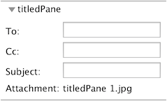 |
- |
| Accordion |  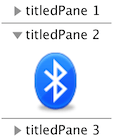 |
- |
| SplitPane |  |
- |
| Pagination |   |
- |
| ScrollBar |   |
- |
| ProgressBar |   |
ProgressBarStyler |
| ProgressIndicator |   |
ProgressIndicatorStyler |
| TextField |  |
TextFieldStyler |
| PasswordField |  |
PasswordFieldStyler |
| TextArea |  |
TextAreaStyler |
| ListView | 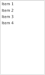 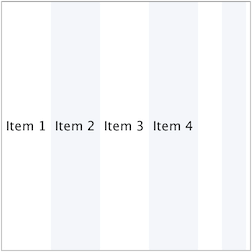 |
- |
| ToolTip |  |
- |
| MenuBar | 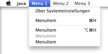 |
- |
| TabPane |  |
TabPaneStyler |
| TableView | 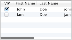  |
- |
| TreeView | 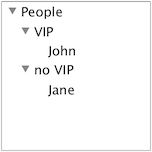 |
- |
| TreeTableView | 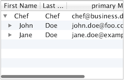 |
- |
