Styling a JavaFX Scrollbar
Styling a scrollbar in JavaFX isn’t that easy since it it composed of several internal nodes. Thanks to CSS all the internal nodes can be styled by using the defined style classes of the nodes.
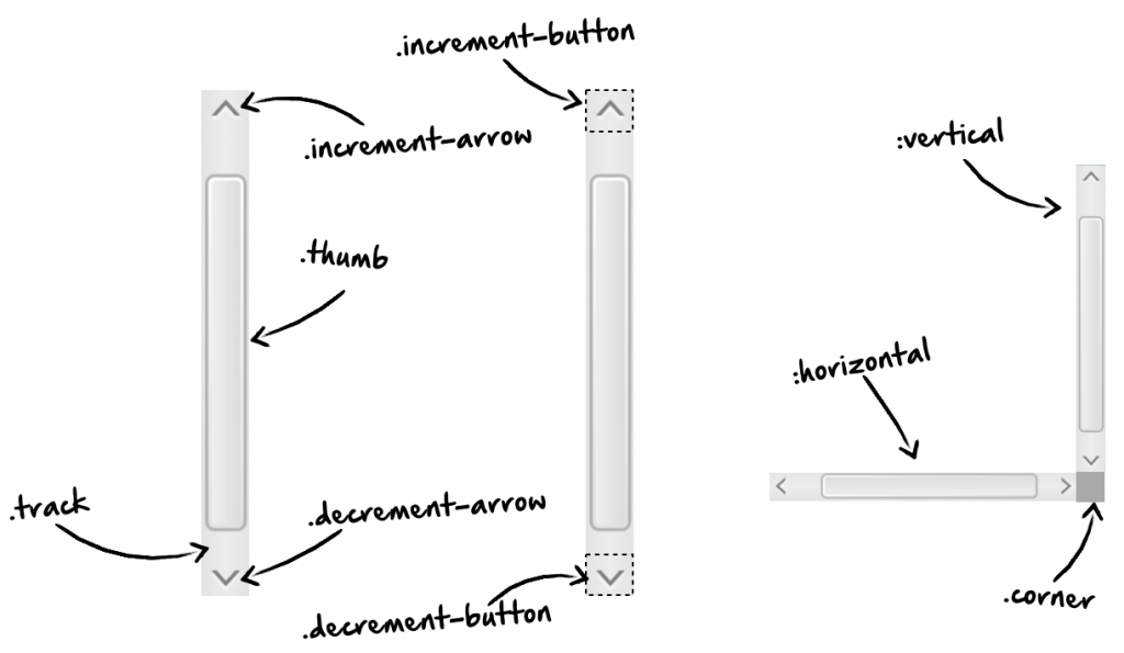
When adding a scrollbar to a scene it will contain the following internal / private nodes:
- A StackPane that defines the background of the track area that can be styled by using the
track-backgroundstyle class - A Button that defines the increment button of the scrollbar. The button can be styled by using the
increment-buttonstyle class - The increment arrow is a subnode of the button and it’s defined as Region. It can be styled by using the
increment-arrowstyle class - A Button that defines the decrement button of the scrollbar. The button can be styled by using the
decrement-buttonstyle class - The decrement arrow is a subnode of the button and it’s defined as Region. It can be styled by using the
decrement-arrowstyle class - A StackPane that defines the track area of the scrollbar. It that can be styled by using the
trackstyle class - A StackPane that defines the thumb of the scrollbar. It that can be styled by using the
thumbstyle class
In addition the scrollbar supports 2 pseudo classes that can be used to define specific styles for a vertical and horizontal scrollbar. This pseudo classes are named “vertical” and “horizontal”.
If you want to use a scrollpane there is this empty little area in the bottom right corner. You can style that area by using the corner style class.
 Hendrik Ebbers is a co-founder of Karakun AG and lives in Dortmund, Germany. He is the founder and leader of the Java User Group Dortmund and gives talks and presentations in user groups and conferences. His JavaFX book "Mastering JavaFX 8 Controls" was released 2014 by Oracle press. Hendrik is JavaOne Rockstar, JSR expert group member and Java Champion.